The meaning of the color on the site
Color is an important tool in website design and can enhance its effect. A beautiful and color-matched site can capture the attention of visitors, improve their mood, and make them more likely to stay on the site longer. And, of course, visitors will perform the necessary actions, such as purchases or registrations.
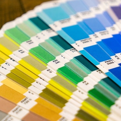
The first step to using color in website design is choosing a basic color palette. It can be chosen according to the purpose of the site, its theme and the message the company wants to convey. For example, the color green is often used on sites related to environmental topics or the sale of products related to a healthy lifestyle. Orange can be used on websites related to education or youth culture.
It is also important to consider the emotional effect of color on site visitors. For example, red can be associated with energy and passion, while blue can be associated with calmness and reliability. Using color combinations can create additional effects. For example, a combination of red and yellow can evoke a feeling of energy and fun, while a combination of blue and green can evoke a sense of calm and harmony.
Additionally, you can use color accents to highlight certain elements on the page. For example, using a bright color for “Buy Now” buttons can help draw attention to them and increase the likelihood that site visitors will take the desired action. This will increase the conversion and profitability of the site.
But do not forget that moderation is the key to success. Using colors that are too bright or inconsistent can cause discomfort for site visitors and lead to their quick exit. Also, do not use too many colors on one page – this can cause information overload and make it difficult to read.

To achieve maximum effect, the color palette must be consistent and appealing to the target audience. Some colors may have cultural or social associations that need to be considered when choosing a color palette. For example, in some cultures red may be associated with danger or bad luck, so using it in website design may not be effective.
It is also important to consider the contrast of colors so that the text and elements of the site are easily readable and visible. For example, using light text on a light background can make it difficult to read. Color contrast can also be used to create visual illusions, such as a 3D effect or highlighting elements on a page.
Animation is another way to use color to enhance the effect of a website. Using color animation can help draw attention to certain elements on the page and make the site more dynamic and interactive. However, keep in mind that too many animations can create additional load on the site and slow down its loading.
Summary. The use of color is an important element of website design that can enhance its impact. Choosing an appropriate color palette and its consistency with the site theme and target audience will interest visitors and increase conversions. But do not forget about the contrast of colors, moderation in the use of animation and taking into account the cultural and social associations of colors.
